The obvious place to test any mobile site, you would think, would be on a mobile device. But, how many devices are we targeting for our site? Depending on the needs of the site, and its owner and users, there could be dozens of devices.
For a web app in particular, it’s important to make sure the site works across as many devices as possible, as we want people to buy through that web app, and they won’t buy if the app doesn’t work for them.
So, what methods are available to us to test for different devices if we don’t actually own all of them? The following methods are available to us: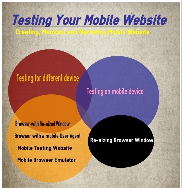
• Using a desktop browser with a resized window
• Using a desktop browser with a mobile User Agent
• Using a mobile testing website
• Using a mobile browser emulator
We’re going to look at these four methods, but first, let’s take a moment to consider testing on the actual devices themselves.
Testing on Mobile Devices
While it’s impossible for any web designer without an unlimited budget to test on all the devices available, it’s a good idea to test on one or two. This is because of the following reasons:
• By holding the site in our hands, we get a much better feel for the design and user experience
• We can test our buttons and links by tapping them and seeing how easy it is to do that accurately
• We can easily test the interactions on the site, for example use of geolocation or the accelerometer if we’re accessing them
• We can experience the speed with which the site loads and interactions take place
So, while it’s not going to be feasible to test on every device we’re targeting, it is a good idea to test on at least one. The most commonly used devices to access the Internet at present are iPhones and Android devices, so if we can get our hands on one of those, it would be much better. We don’t have to own one—borrowing will do. But, for a web designer making a living from building mobile sites, buying a smartphone is probably going to be a worthwhile investment.
Re-sizing Browser Window
So, if we don’t have access to a variety of devices, or want to test quickly without having to switch from our desktop browser, what’s the quickest way to test our site?
The answer is simple—for a site that uses media queries only (that is, it doesn’t send different content to different devices), we can just resize the browser window. And we can do this most easily if we use an extension.
Author Info:
SufalamTech specializes in creating, maintaining and marketing mobile websites. The company has a team of proficient mobile application developers, successfully working with major corporations across the world.